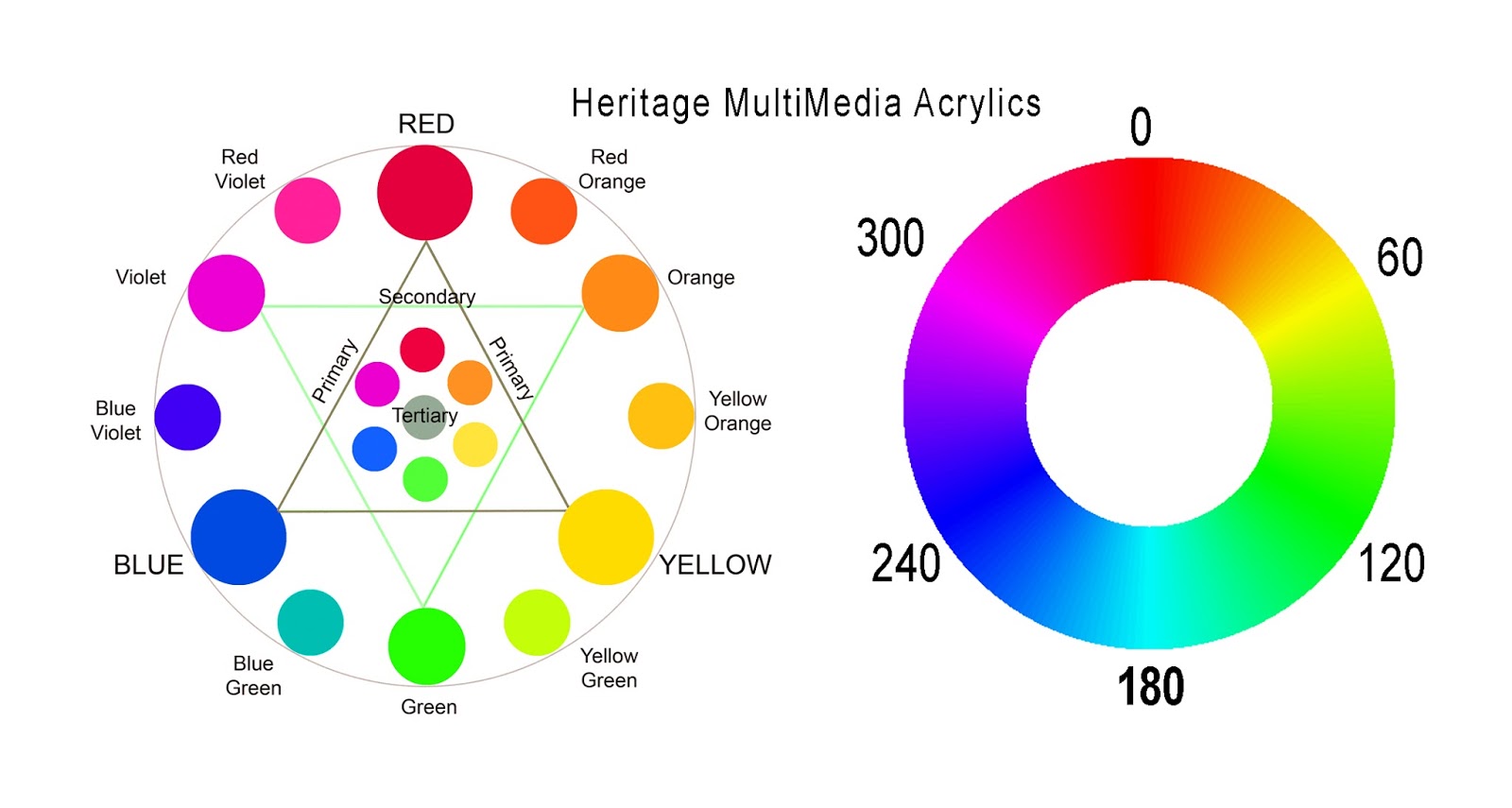
I have been teaching color theory for 30 years. Many artists place different colors at the top of the wheel. It doesn’t really matter what is at top, but here is
why I place red. I studied chemistry and physics in college, so I take the little I remember about it into the art world I live in now. Hue which is the property we call “color” is a “color appearance parameter” and used to describe a position of that color in light. Light is measured in wavelengths and degrees.

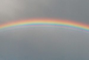
The color red sits at 0 degrees in light. Green sits at 120, Blue at 240 etc. Since red sits at 0 degrees, that means in light it is at the top of the prism. After a good rain, check for the rainbow. The water vapor will bend, or refract the light causing the rainbow. When this happens look at the positions of the colors.. ROYGBV red, orange, yellow, green, blue, violet. Red is at the top because it is at 0 degrees to the light.
This is why in all the color theory I teach I place red at the top. It is the same thing nature does. Now I realize that yellow at the top makes a pretty wheel, but starting at the top with 0 and working around the wheel in degrees seems a little more natural thing to do. Just like nature.
Artist are all different. We have different ways to do things. Whatever is at top doesn’t change the mixing theory. Just an interesting fact. Have a great painting day.
